September Art Agency
Case studyCreative agency · website + custom CMS
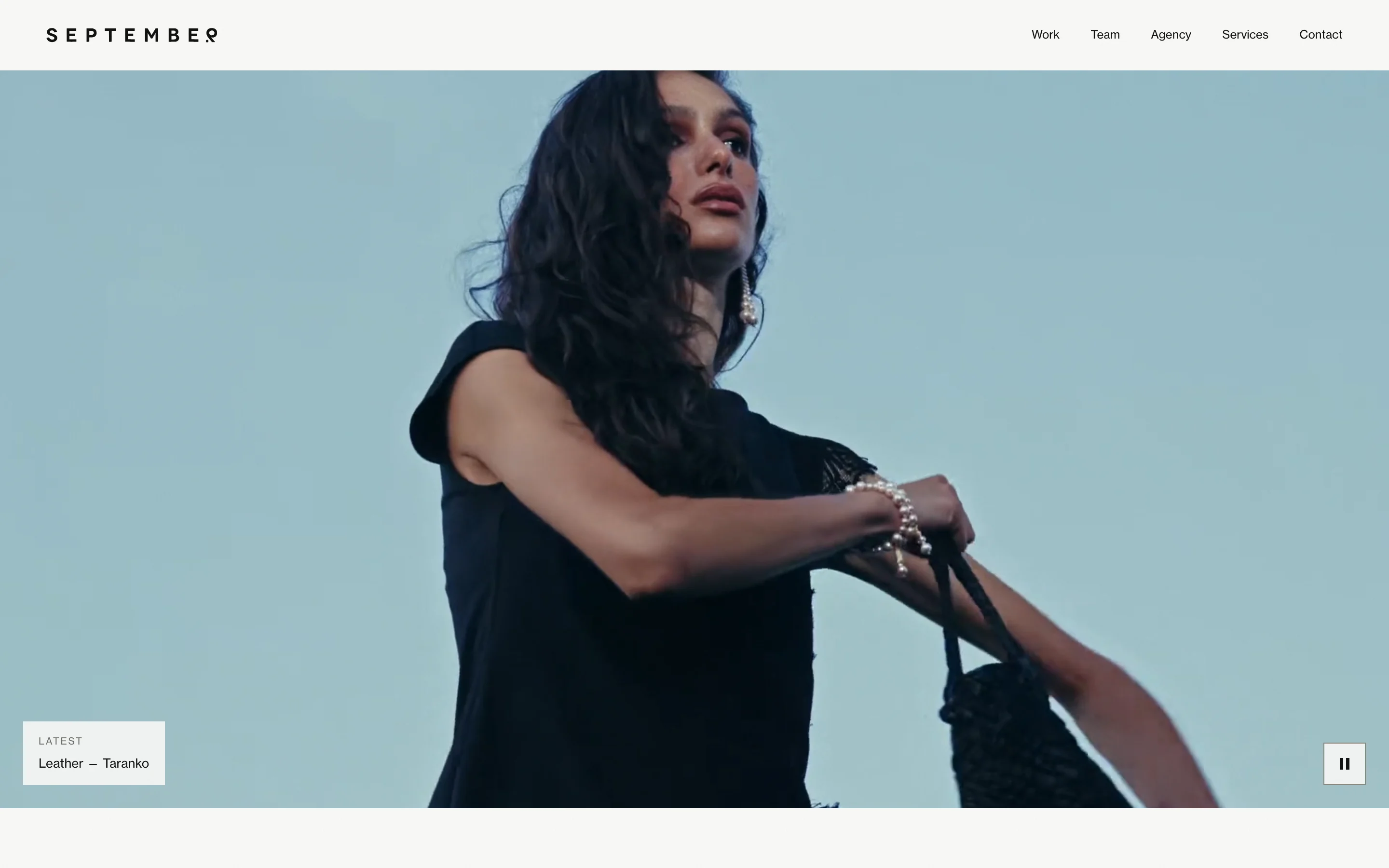
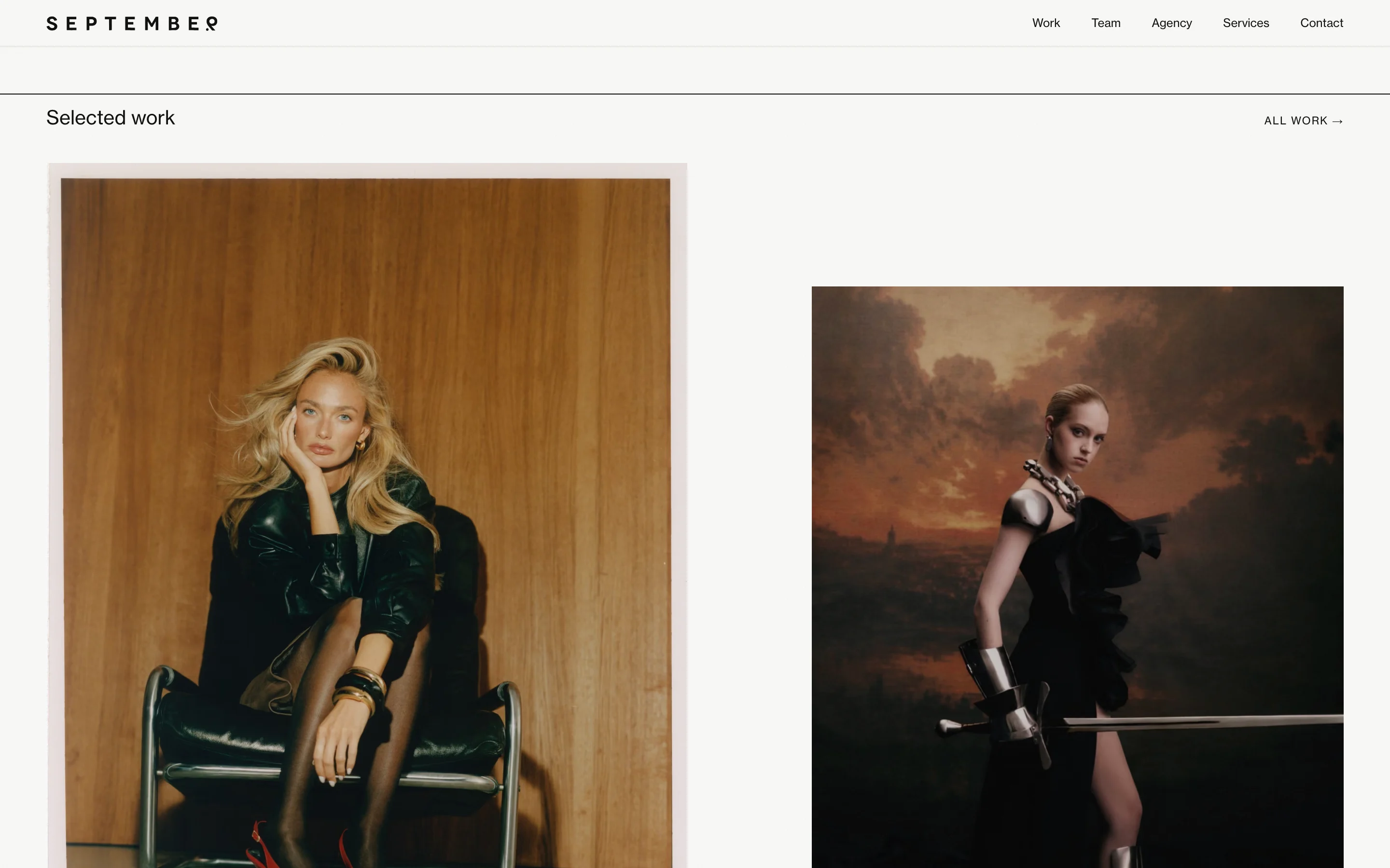
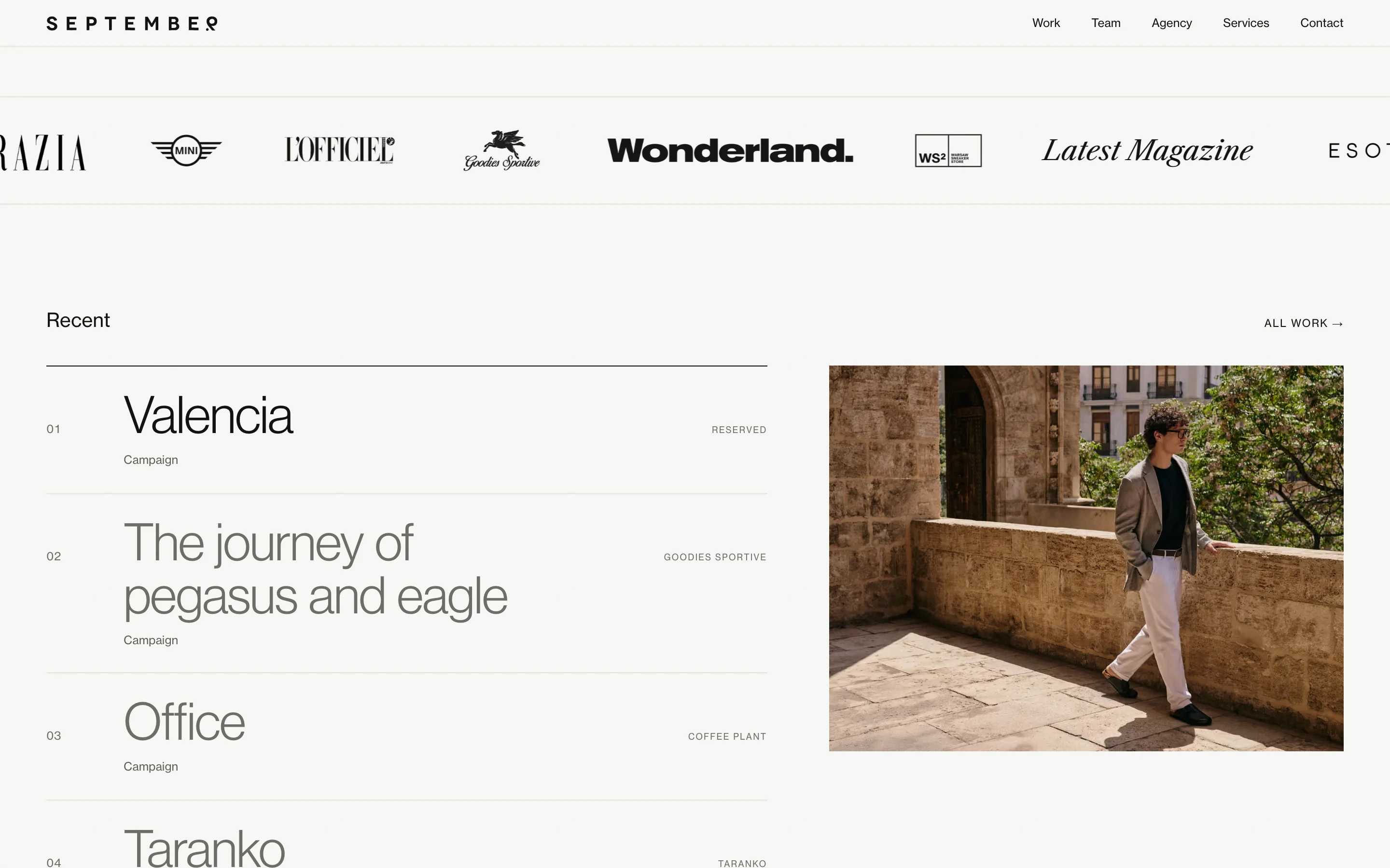
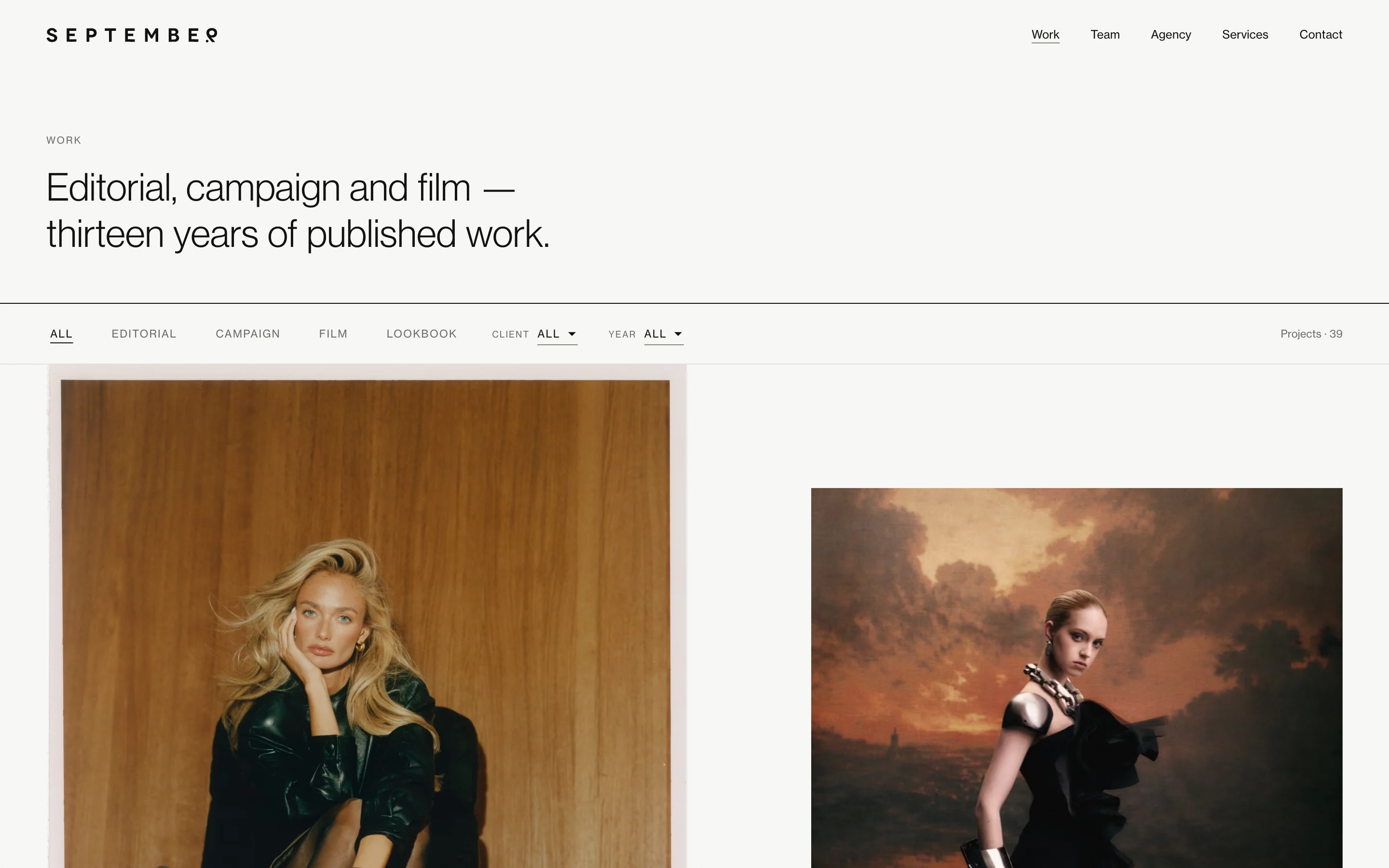
an editorial website and a custom CMS for a fashion production agency
September produces editorials and campaigns for international magazines and brands. Their old site treated a magazine cover story and the smallest job the same way: a gallery with no title, no credits, no context. The new one is a two-colour editorial system where every project carries its full crew, every name links to a person, and the rules that keep it looking like a magazine live in the CMS, not in a style guide nobody opens.
Overview
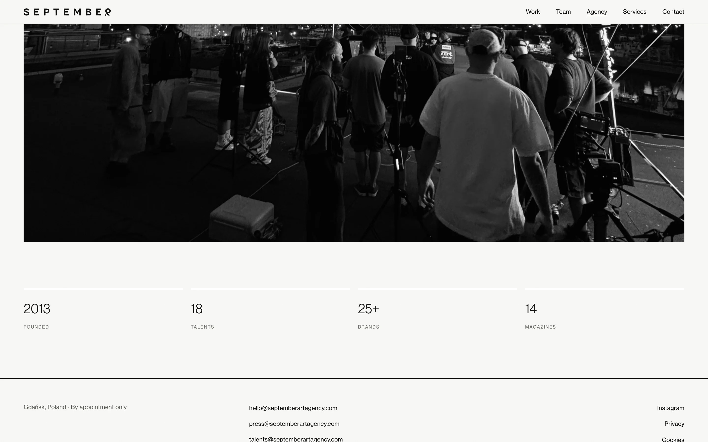
September Art Agency is a creative and production agency from Gdańsk, working internationally since 2013: photography, film, art direction and full production for clients like Numéro Switzerland, Elle Polska, adidas, New Balance and Puma. The site is their portfolio, their roster and their inbox.
The scope was the whole thing: UX and UI, the build, a custom admin panel, migration of the existing portfolio, and the documentation the team needs to keep it alive. Today it holds 39 projects and an 18-person roster, all edited through the panel.
My Role
Everything, solo. Design, front-end, back-end, the panel, the migration, the manual and the video walkthrough.
The Challenge
The old site had three problems, and none of them were visual.
- It opened with text. The first screen said what the agency provides. A client coming from a trade fair needs five seconds to see who they're dealing with, and a list of services doesn't tell them.
- No hierarchy. An international editorial and a small local job sat side by side in the same grid, with the same weight.
- Projects had no frame. A project was a set of photos: no title, no client, no crew. For an agency that sells people (photographers, directors, art directors), that hid the product.
On top of that, the brief was strict in a way I liked: two colours, one type family, no parallax, no particle effects, no custom cursor. And performance and accessibility were not aspirations. Lighthouse thresholds and WCAG 2.2 AA were written into the contract as conditions of acceptance.
Approach
References before pixels
Before I drew anything, I built a small voting app for the kickoff call: 21 reference sites, three people from the agency voting on each one. It turned an hour of "I like this one" into votes we could count, and it's where the typeface got decided.
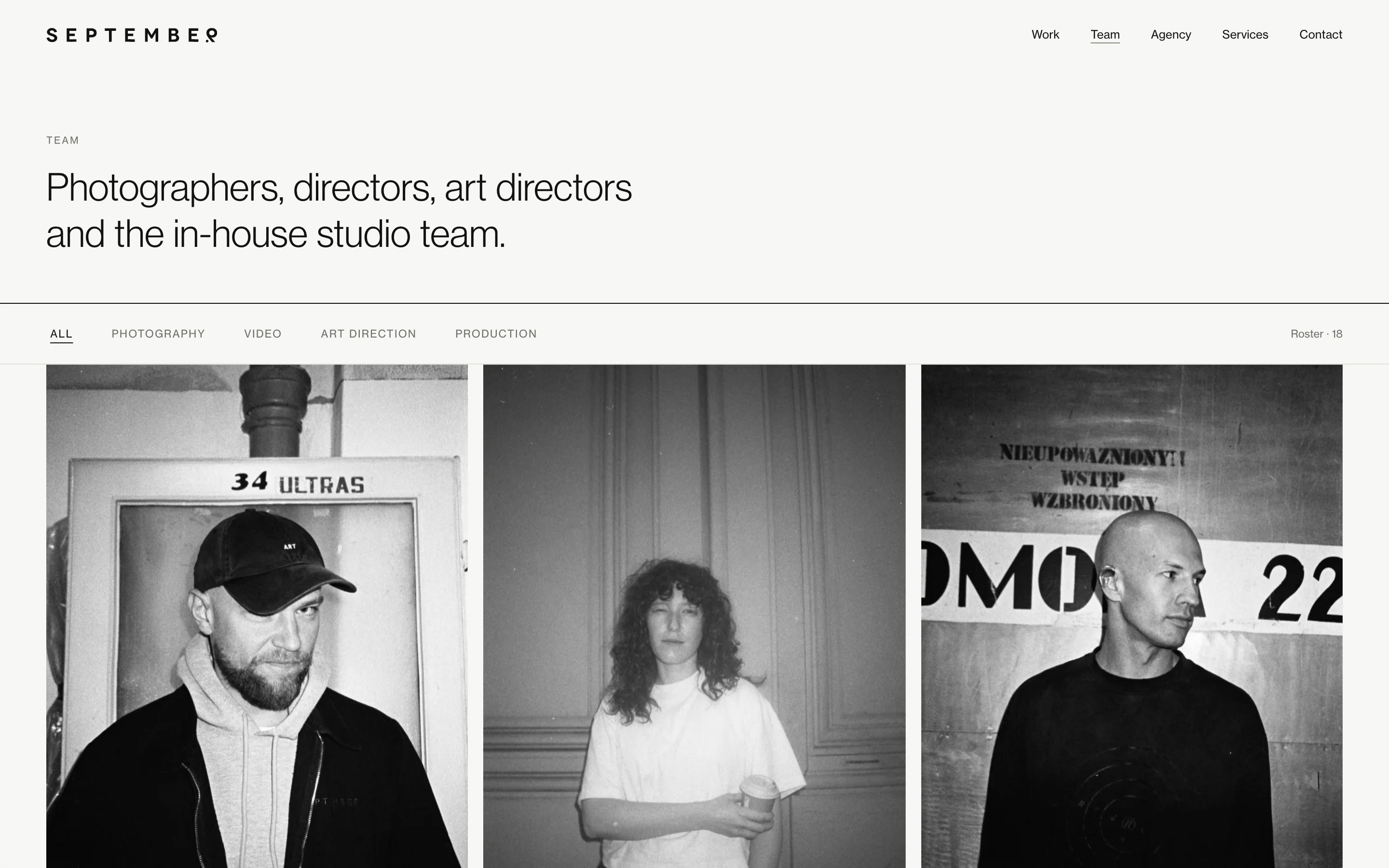
Then I mapped every component to the reference it came from and audited my own first version against that map. One component failed outright and three were only partly right. The failure was the roster: I had designed filters for the eight people in the brief when the agency had three at the time. Version two was built for the content that existed, with a structure that could grow. It has since grown to 18 without a rebuild.
Two colours, and the brief fails its own test
Paper #FAFAF7, ink #111111, and no accent colour anywhere in the interface. Colour comes only from the photographs and video. Form errors are signalled with border weight and type weight, not red.
The brief's own palette didn't pass the accessibility level the brief demanded. Its light grey gave 3.39:1 on paper, below the 4.5:1 that AA requires for small text. I measured it, moved it to a tone at 4.95:1, and did the same for form borders (1.42:1 raised to 3.32:1). It still reads as the same palette. It just meets its own requirement now.
Credits as the sales mechanism
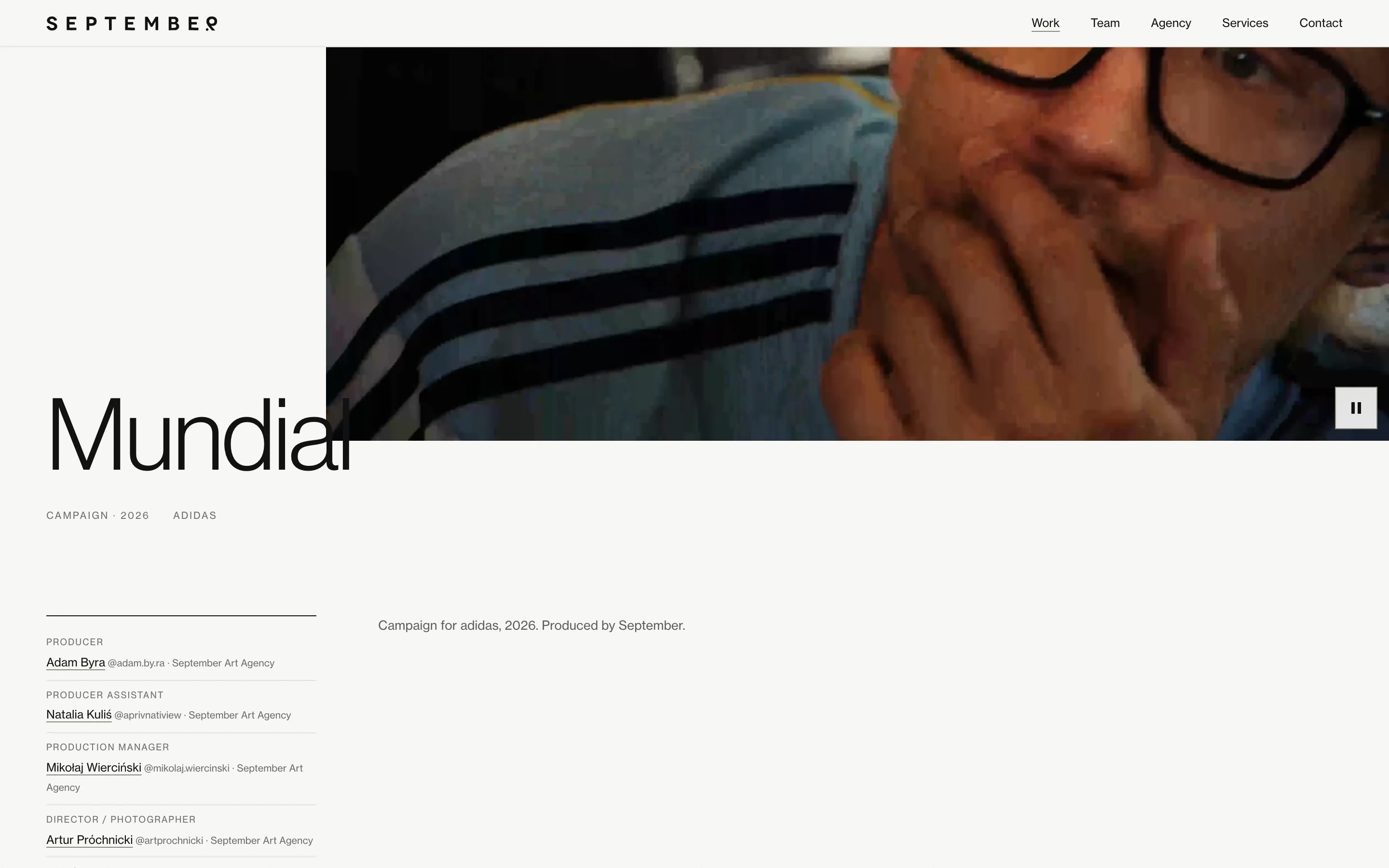
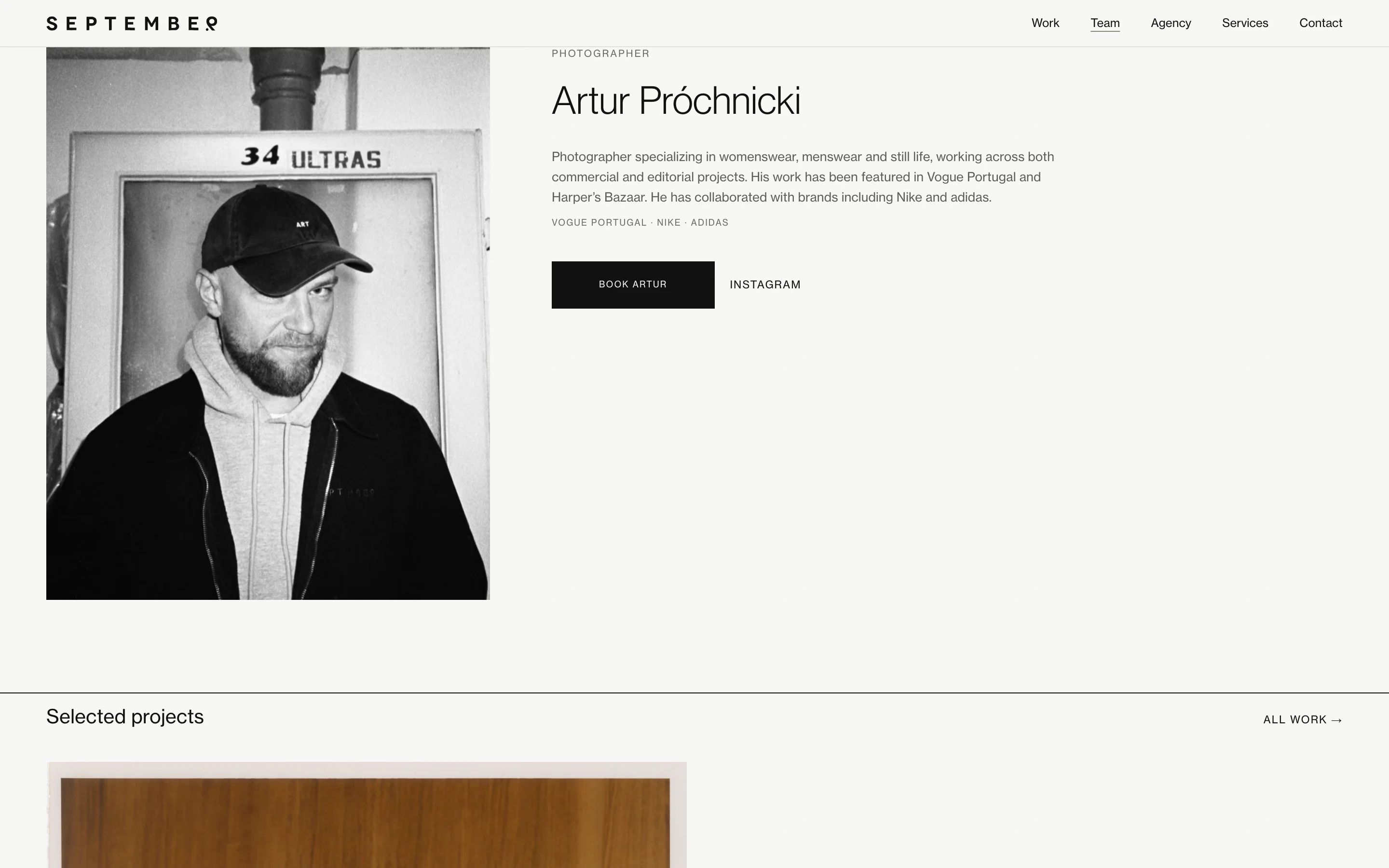
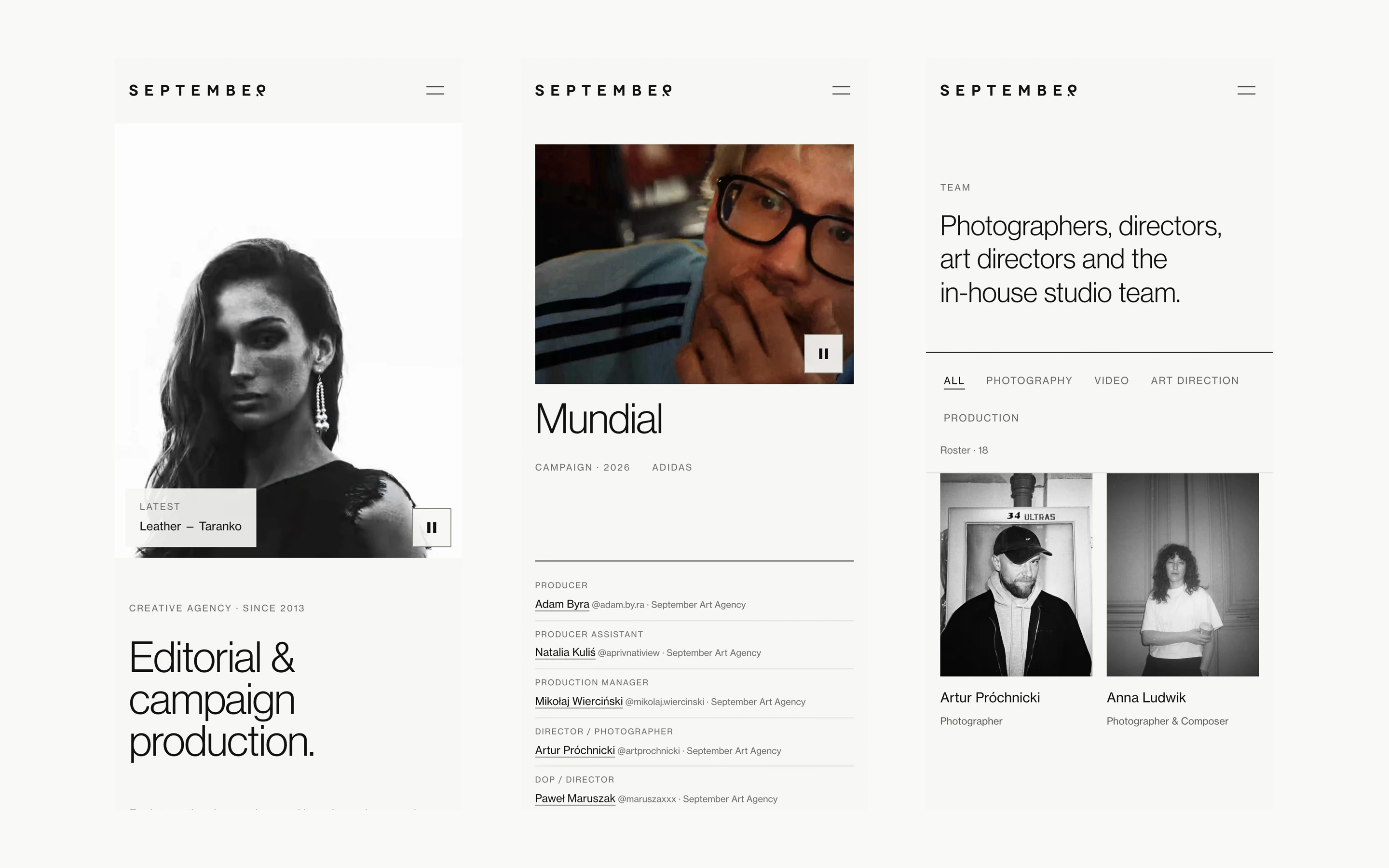
Every project page carries its crew. The adidas "Mundial" campaign lists 35 credit lines, and 12 of them link to a team page. Each person's page pulls in every project they are credited on. Work and Team are two entrances to the same network, which is how the agency sells its talent: you arrive for a campaign and leave on a photographer's page with a "Book" button.
Video first, without paying for it at first paint
The homepage opens with a film, not a headline. A still frame holds the place and the video arrives after the first paint, with separate files for desktop and phone, so the first screen doesn't wait for the video file.
A panel that enforces the rules
No headless SaaS. I wrote the panel for this team and this site, in their language (the site is English, the panel is Polish).
The idea behind it: the people editing the site are producers, not designers, so the design rules have to live in the tool.
- An image without alt text doesn't save. Accessibility is a condition, not a reminder.
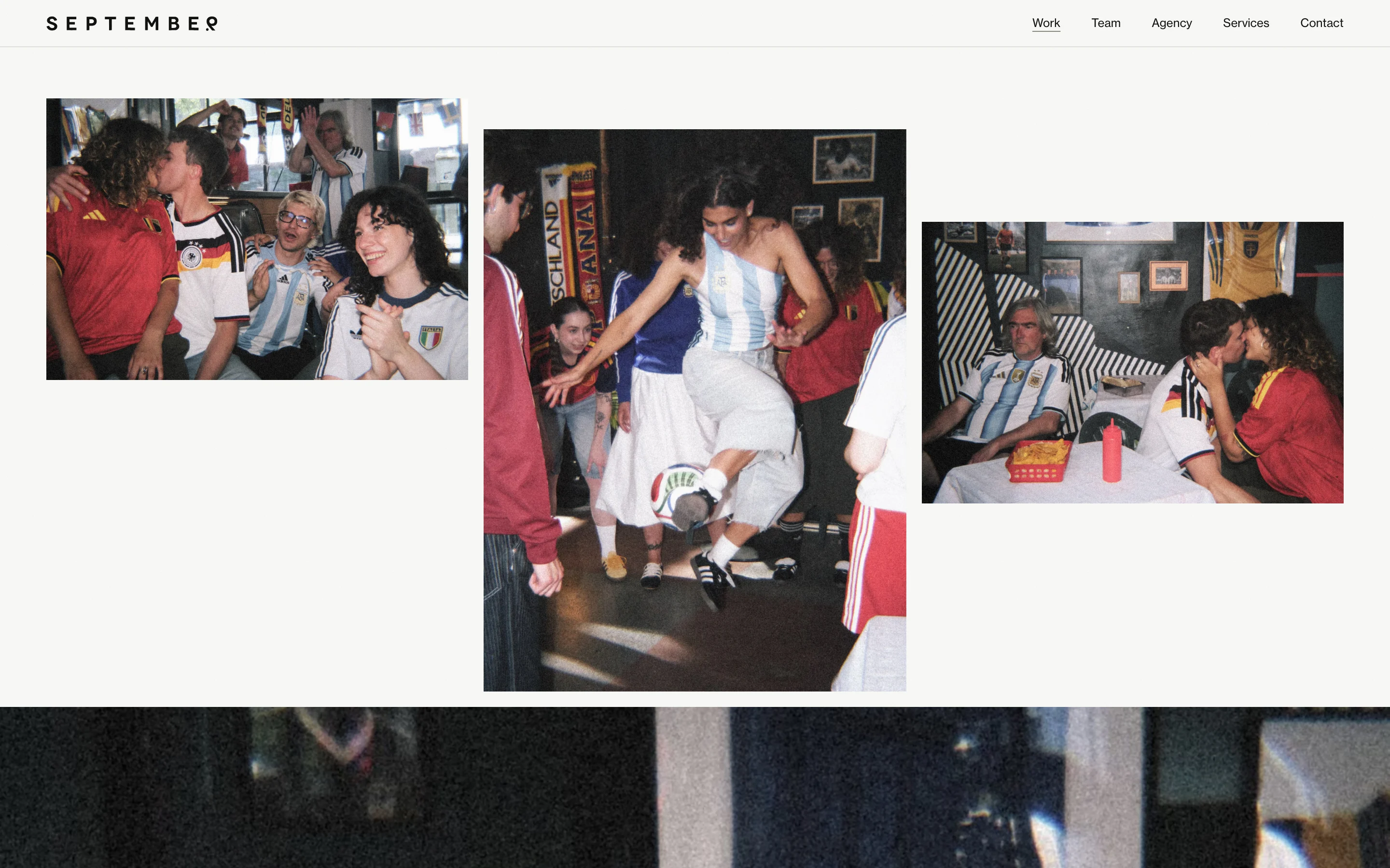
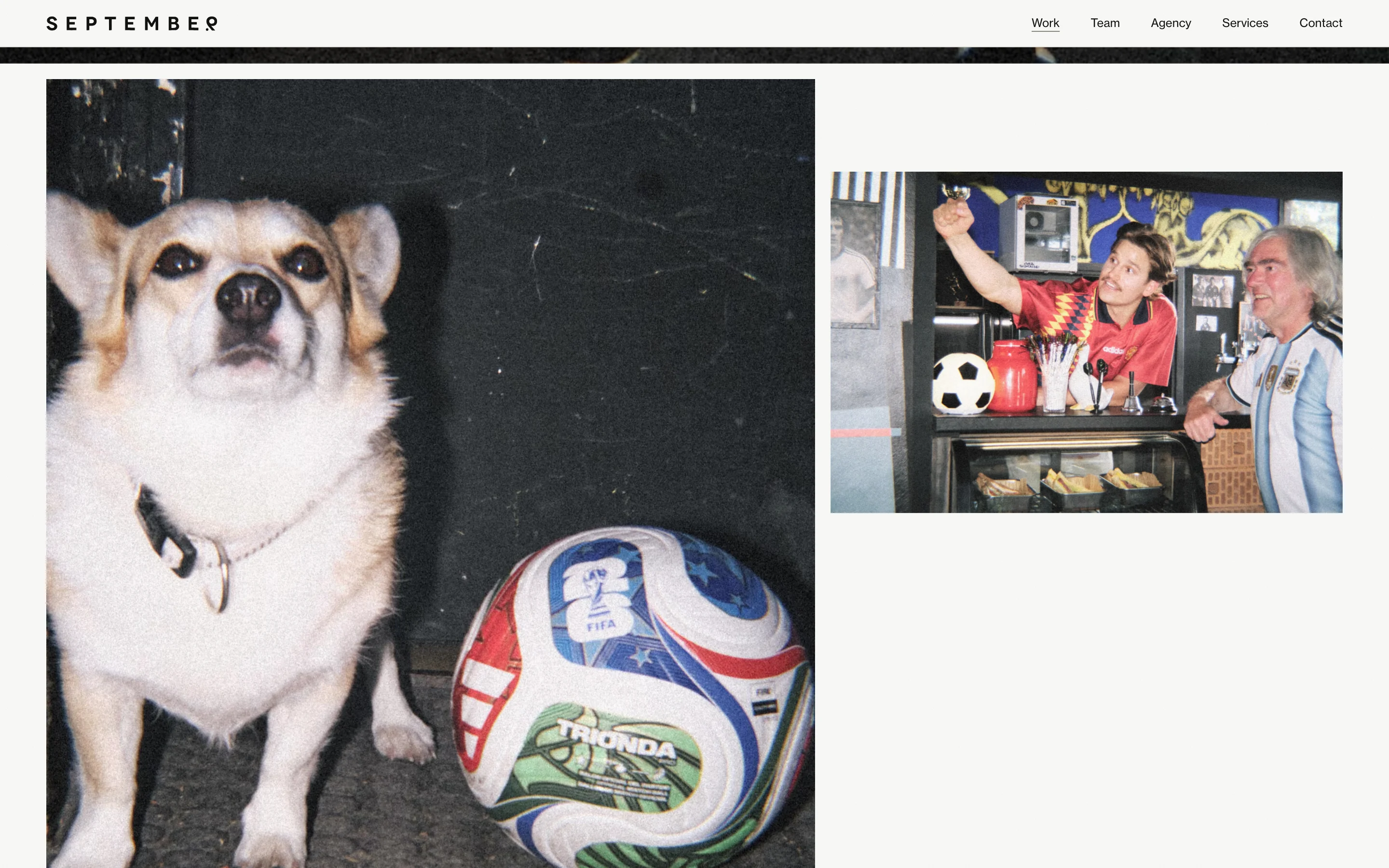
- Galleries are built from modules (full width, diptych, triptych, video) and the panel explains the rhythm: after a full-width frame comes something denser, or the page reads like a catalogue.
- Aspect ratio is read from the file. Editors upload the original, cropping happens on the page, and the panel shows which ratio the site will use and why.
- The dashboard is a to-do list. Two lists: what blocks publication and what just makes the site poorer, each item linking to where you fix it and saying what happens if you don't.
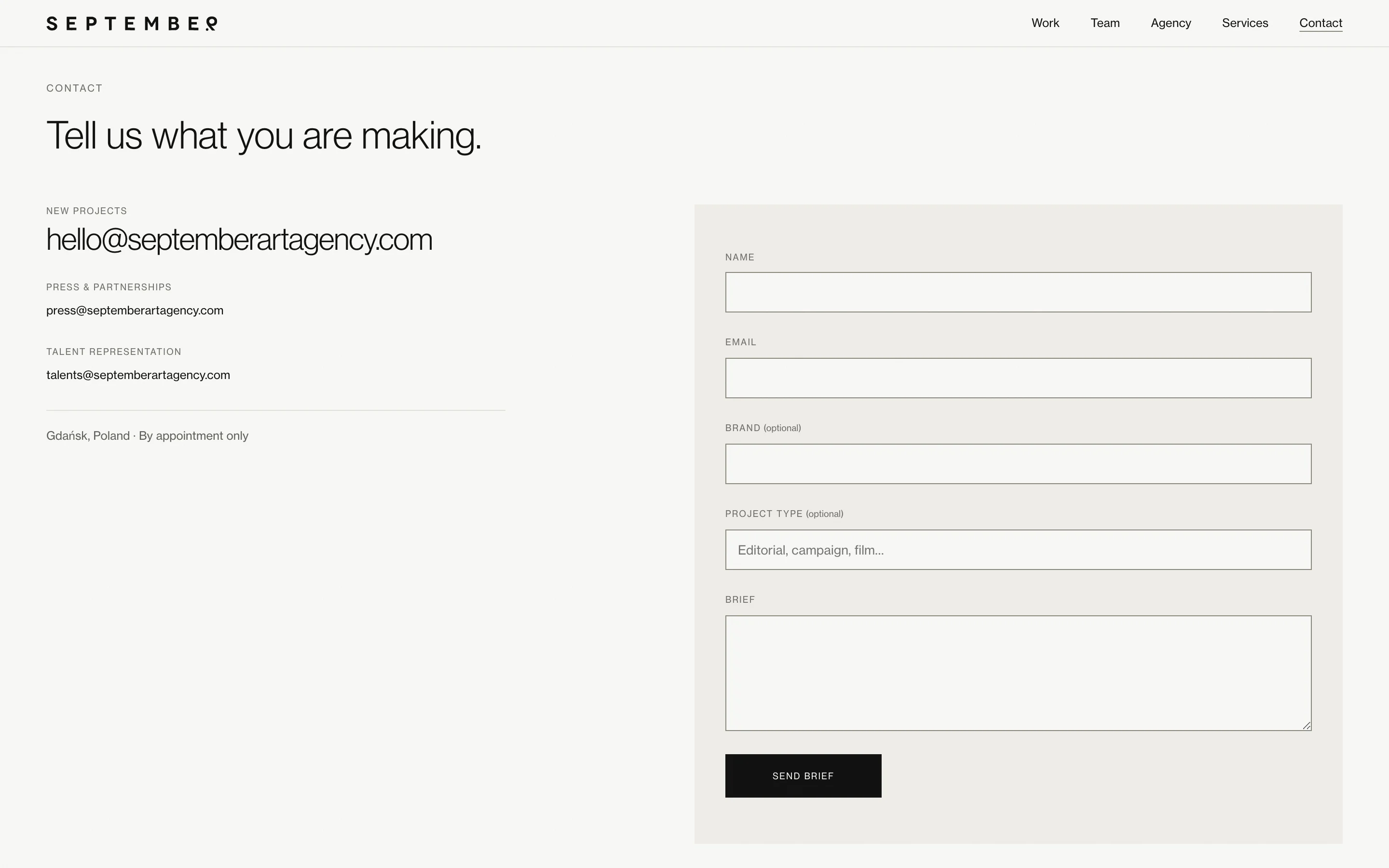
- Briefs are stored in the database, independent of email, with a label when the notification failed to send.
- The media library knows where each file is used, and only unused files can be removed.
- Analytics run only after consent. Editors paste an ID, the site builds the script, and nothing reaches Google before the visitor agrees.
Changes go live on save. Nobody waits for a deploy.
Documentation is part of the product
The panel ships with its own manual: 12 chapters, 42 topics, 57 steps. From the same source text I produced a video walkthrough (8 minutes 36 seconds, 16 chapters) and 14 short clips, one per area of the panel. One source, three formats, so they can't drift apart.
Results
The site is live at septemberartagency.com with 39 projects and an 18-person roster, managed from the panel. It shipped three weeks ahead of the contractual deadline.
Lighthouse on the homepage, median of three runs each (8 October 2026): desktop 98 Performance, 100 Accessibility, 100 Best Practices and 100 SEO, with LCP at 0.4 s and CLS at 0; mobile 99, 100, 100 and 100, with LCP at 1.5 s and CLS at 0.
I don't have traffic or inquiry numbers to show yet, and I won't invent them. What I can show is what the client said:
"We couldn't be happier with the collaboration! The website turned out exactly the way we imagined it: polished, good-looking and true to what we expected. Piotr understood our vision perfectly and turned it into a finished project. Communication was quick, and the whole process went smoothly and in a great atmosphere. Highly recommended!"
— September Art Agency
Key Takeaways
- Put the rule in the tool. A style guide is a document people forget. A Publish flow that refuses an image without alt text is a rule that survives the handover.
- Measure the brief. The palette I was given failed the accessibility level I was contracted to hit. Checking it before the first mockup saved an argument at acceptance.
- Design for the content that exists. My first roster was built for a team of eight that was three people at the time. Building for three, with room to grow, is what let it reach 18.